How to Choose the Perfect Minimalist Color Palette for Home
A well-chosen minimalist color palette can transform your home into a space that feels effortlessly elegant, serene, and high-end. In 2025, the key to achieving a modern minimalist home is using colors to create a timeless, sophisticated look. This guide will help you choose the perfect minimalist color palette for home.
Table of Contents
Minimalist home design is more than just a trend—it’s a lifestyle choice that prioritizes simplicity, intentionality, and beauty.
According to recent design surveys, 61% of homeowners now prefer minimalist interiors for their calming and uncluttered aesthetics. This is a big shift toward intentional living.

The Appeal of a Minimalist Color Palette for Home
At the center of every minimalist space is a carefully chosen color palette.
The right minimalist color palette can:
- Transform a home,
- Evoke feelings of serenity, balance,
- Bring elegance while eliminating visual clutter.
Think of your home’s color palette as a carefully curated capsule wardrobe:
Every shade should serve a purpose, complement the others, and contribute to a cohesive whole.
Achieving this balance doesn’t require hiring an expensive color consultant or completely replacing your existing furnishings.
As an architect and interior designer, I’ve helped many homeowners achieve that coveted minimalist luxury look while working within realistic budgets.
In this comprehensive guide, you’ll discover:
- Why certain color combinations instantly elevate your space’s perceived value
- How to choose the perfect neutral base that works with your existing furniture
- Professional tricks for making budget-friendly materials look high-end through strategic color use
- Practical solutions for common color challenges in different lighting conditions
- Step-by-step instructions for creating your own minimalist color scheme
Whether you’re dealing with a full renovation or refreshing a single room these proven strategies will help you create a space that feels both minimalist and livable.
Why Minimalist Color Palettes Matter
Minimalist design revolves around simplicity, clarity, and purpose—values that extend directly to the colors we choose.
Neutral tones and muted shades create a calm and uncluttered environment.
These palettes bring visual and mental clarity, helping to reduce stress, enhance focus, and establish a harmonious flow throughout your home.
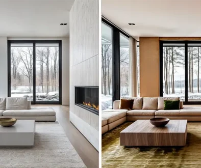
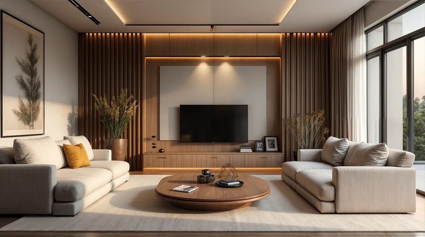
Whether it’s a soft dove gray wall or the warm embrace of greige, each hue contributes to a sense of balance and tranquility that defines minimalist living.
This approach, often called warm minimalism, prevents spaces from feeling cold or impersonal.
While working with clients, I’ve seen countless times how the right color palette can transform a home into a sanctuary.
What Is a Minimalist Color Palette for Home?
A minimalist color palette is a design approach that emphasizes simplicity and harmony through a limited selection of colors.
It typically features neutral tones and muted hues, creating a serene backdrop that allows other design elements to shine.
It can also incorporate accent colors to enhance visual interest.
This style works exceptionally well in home design.
It fosters an environment of calmness and clarity.
By stripping away the clutter of excessive color, a minimalist palette invites tranquility into your space.
It makes it feel more open and inviting.
Minimalist color palettes for home design emphasize simplicity, restraint, and a focus on essential elements.
Principles of Minimalist Design
Minimalist design starts with the principle of “less is more.”
This philosophy encourages us to embrace simplicity.
This means focusing on essential elements rather than overwhelming the space with unnecessary decor.
Neutral tones and muted colors are the cornerstone of this approach.
Function and form take precedence in minimalist design.
Every piece of furniture and decor should serve a purpose while contributing to the overall visual harmony.
Declutter to let colors shine.
By minimizing distractions, you allow the chosen colors and design elements to shine.
Common Colors in a Minimalist Color Palette
As mentioned, minimalist color palettes have a few foundational hues that embody simplicity and elegance.
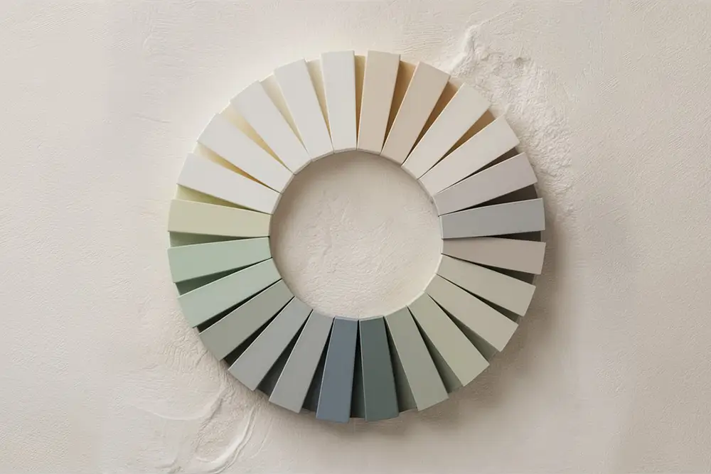
Neutral Tones
Common colors in a minimalist color palette typically include a range of neutral colors like white, beige, and shades of gray. These shades provide a versatile foundation that can adapt to various styles and settings.
Dominant colors like warm neutrals can create a sense of serenity and calm.
Accent Tones
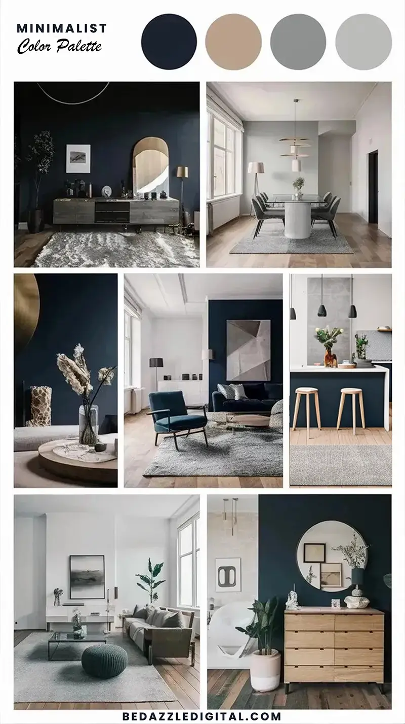
Accent tones like soft blues, sage green, earthy browns, and even stronger, darker options can be combined to add depth and interest without overwhelming the senses.
Monochromatic Schemes
Monochromatic schemes, where different shades of the same color are used, can further enhance this effect.
Minimalist Color Palette Table
Here’s a breakdown of these common colors, along with how they can be combined:
| Color Group | Examples | Key Characteristics |
|---|---|---|
| Whites | Crisp white, warm ivory, off-white | Bright, clean, and versatile. Ideal for open spaces and creating a sense of purity. |
| Grays | Soft dove gray, charcoal, greige | Adds depth and subtle sophistication. Works beautifully with natural light. |
| Beiges & Earth Tones | Sand, taupe, camel | Warm and grounding. Brings a cozy, inviting feel to minimalist spaces. |
| Blacks | Jet black, charcoal black | Best used sparingly for contrast and definition. Adds a bold, modern edge. |
| Greens | Muted sage, olive, forest green | Calming and refreshing. Ideal for incorporating a touch of nature and balance. |
| Blues | Pale blue, dusty blue, navy | Versatile and soothing. Pale blues evoke serenity, while navy adds a classic and bold accent. |
When these colors are thoughtfully layered they create a balanced and cohesive aesthetic that’s both timeless and functional.
For example, pairing warm ivory walls with taupe furniture and a hint of charcoal in decor elements.

Adding Depth with Accent Colors in a Minimalist Color Scheme
One of the most common misconceptions about minimalist design is that it’s all about stark whites and neutrals.
Yes, these foundational colors set the stage, but:
Accent colors play a critical role in adding depth and visual interest to avoid a flat, uninspired look.
Choose accents that complement rather than overwhelm your minimalist aesthetic.
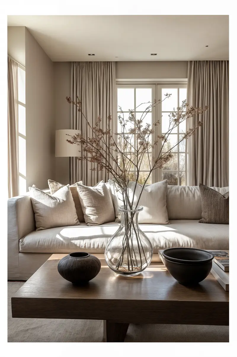
Subtle pastels like blush pink, muted sage, or dusty blue bring a soft, airy quality to your space.
They’re perfect for introducing a hint of color without disrupting the serene aesthetic.
For those seeking a more dramatic touch, deep tones like navy, forest green, or even burgundy offer sophistication and a sense of luxury.
A well-placed navy throw pillow or a forest green accent chair can become focal points without overpowering the room’s calm atmosphere.
To strike the right balance, think of accents as the finishing touch—used sparingly but intentionally.
Pair soft pastels with light neutrals, and reserve deeper hues for contrast against whites or earth tones. This harmony ensures your minimalist interior remains both dynamic and cohesive.
Minimalist Color Palette Accent Colors: Table overview
Before diving into the table, think about your space’s current palette. How could these accents enhance it?
Accents should complement the foundational colors, acting as the perfect bridge between functionality and style.

Tips for Choosing the Right Color Palette for Your Minimalist Space
Choosing the perfect minimalist color palette for your home is about creating a harmonious environment tailored to your lifestyle and space. Here are four essential tips to help you curate a palette that feels both intentional and functional:
1. Assess Natural Light
Light has a tremendous effect on colors.
In rooms with abundant natural light, whites and soft neutrals will appear crisp and luminous, enhancing the feeling of openness.
North-facing rooms, which tend to receive cooler light, benefit from warmer shades like ivory or greige to counterbalance the shadows.
Test paint swatches throughout the day to see how lighting influences the tone and mood of your space.
2. Match Colors to Your Space’s Purpose
Consider the purpose of each room when selecting colors.
For spaces dedicated to relaxation, such as bedrooms or reading nooks, opt for calming shades like muted sage, pale blue, or soft beige.
For areas where energy and focus are needed—like home offices or kitchens—brighter neutrals and subtle contrast (think whites paired with charcoal or navy) can create a clean and invigorating atmosphere.
3. Factor in Textures and Materials
Colors don’t exist in isolation. They interact with the textures and materials in your home.
Pair a soft dove gray with natural linen curtains, or contrast smooth white walls with a warm wood table.
Earthy accents like terracotta or clay can further add warmth when combined with stone or matte finishes, ensuring your palette feels tactile and grounded.
4. Create a Cohesive Flow Between Rooms
A minimalist home thrives on harmony. Aim for a unified color scheme that connects different spaces.
Use variations of the same base color—for instance, layering whites and soft grays in the living room and introducing muted greens or blues in bedrooms—to maintain consistency while adding subtle variety. This seamless flow enhances the sense of space and makes your home feel intentional and thoughtfully designed.
Need minimalist living room inspiration? Check out this article.
Common Mistakes in Minimalist Color Schemes and How to Avoid Them
Even with the best intentions, it’s easy to make missteps when creating a minimalist color palette.
Here are four common mistakes I see as a designer—and how to avoid them:
1. Overusing White to the Point of Sterility
White is the cornerstone of many minimalist palettes, but too much white without balance can make a space feel cold and clinical.
To avoid this, introduce soft textures (like natural linens or wool) and subtle contrast with warm neutrals or light wood finishes to add depth and warmth.
2. Adding Too Many Accents
Accents are essential for avoiding monotony, but overdoing them disrupts the calm simplicity that defines minimalism.
Stick to one or two accent colors and use them sparingly—think a navy throw blanket or a muted green vase—so they enhance, not overwhelm your space.
3. Ignoring Undertones That Clash
Undertones are the subtle hues that lie beneath a color (e.g., warm undertones like yellow or cool undertones like blue).
Mixing warm and cool colors without intention can create visual disharmony.
For instance, pairing a cool gray wall with beige furniture might look off. Always test colors together under your home’s natural lighting to ensure they complement each other.
4. Neglecting Functional Practicality
Minimalist design prioritizes beauty and function equally.
While white walls look stunning, they can also highlight stains and scuffs, especially in high-traffic areas.
Opt for washable or durable paint finishes and balance white surfaces with practical, forgiving colors like taupe, greige, or earthy tones for longevity and ease of maintenance.
Practical Tools for Building Your Palette
Creating the perfect minimalist color palette doesn’t have to be daunting.
Today, there are several tools and methods to help you explore, visualize, and test your color choices before committing.
Here are my go-to strategies:
1. Use Paint Swatches and Samples
Start by collecting paint swatches or purchasing sample pots from your local hardware store.
Test these colors directly on your walls, painting swatches in different areas of the room to see how they look under various lighting conditions throughout the day.
Natural light, artificial light, and shadows can dramatically change how a color appears.
2. Leverage Digital Tools
Online platforms like Pinterest, Canva, and design apps such as Adobe Color or Benjamin Moore’s Color Portfolio allow you to create mood boards and experiment with palettes virtually.
Pinterest boards, for example, are great for saving inspiration and curating colors that align with your design vision. Design apps often let you upload photos of your space and overlay colors, giving you a preview of the final result.
3. Draw Inspiration from Nature
Nature is one of the most reliable sources for timeless color palettes.
Look to landscapes—soft sand beaches, serene forests, or clear blue skies—to find combinations of neutrals, greens, and blues that inspire tranquility.
These organic tones naturally complement minimalist spaces, bringing a sense of balance and calm.
4. Seek Out Design Magazines and Curated Boards
Interior design magazines like Architectural Digest and curated online collections offer pre-selected palettes tailored to modern, minimal homes. They’re a great way to spark ideas and refine your vision for your own space.
By combining these tools—physical swatches, digital platforms, and natural inspiration—you can confidently build a palette that reflects your style and the serenity of a minimalistic ambiance.
Minimalist Color Palette for Home: Final Thoughts
A thoughtfully curated minimalist color palette transforms your home into a serene and harmonious retreat.
Embrace simplicity and choose colors that reflect your space, light, and lifestyle to create an environment that feels both intentional and timeless.
Whether you lean toward soft neutrals, calming greens, or bold accents like navy, remember that minimalism isn’t about deprivation.
It’s about choosing what truly enhances your home.
Need more inspiration or guidance?
Explore my warm minimalist color palette guide next!
Minimalist Color Palette for Home FAQ
-
What is a minimalist color scheme?
-
What is a minimalist favorite color?
-
What are the best colors for a minimalist house?
-
What are warm colors for minimalism?
-
What are the best neutral colors for a minimalist color scheme?
-
How many colors should I use in my minimalist scheme?
-
Can I use bright colors in a minimalist design scheme?
-
What’s the foundation of minimalist design when it comes to color?
-
How can I add interest to a minimalist color palette?
-
Are there any specific colors that create a sense of calm?
-
What is a monochromatic palette, and how does it fit into minimalist design?
-
Can I mix warm and cool neutral tones in my minimalist palette?
Share your design inspirations:
About the Author

Branka Dancevic Architect & Interior Designer
Hi, I’m Branka! As a third-generation architect with two decades of experience, I’m passionate about creating warm minimalist spaces that feel luxurious without excess. I founded Bedazzle Digital to share my approach through design guides and resources. When I’m not transforming clients’ homes, you’ll find me testing new color palettes and hunting for the perfect balance of texture and simplicity. Join me in exploring stylish and sophisticated (mostly minimalist) interiors that are anything but boring!