
Warm Minimalist Color Palette: Neutral and Earthy Hues
Discover how to create a warm minimalist color palette that transforms your home into a serene, sophisticated sanctuary with these easy-to-follow design tips. We’ll break down how to build this foundation room by room and get inspired.
Table of Contents
The Magic Formula for Warm Minimalist Color Palettes
I’ve fallen in love with warm minimalist color palettes because they create elegant and inviting spaces.
Unlike cold minimalism that can feel stark and unwelcoming, a warm minimalist approach combines the clean simplicity we crave with earthy tones that make a space feel like home.
The foundation of any warm minimalist palette? Neutral and earthy hues that create instant calm and sophistication while letting textures shine through.
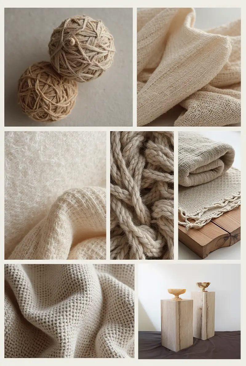
Image 1: A mood board featuring swatches of warm neutral and earthy toned fabrics (linen, wool, boucle), paint chips in off-whites, beiges, and muted terracotta, alongside natural elements like dried grasses and a piece of light wood.
Neutral & Earthy Tones: The Foundation of Warm Minimalism
Think of your color palette as the soul of your home’s aesthetic. For that sophisticated, warm minimalist vibe, lean heavily into neutral and earthy tones. We’re talking creamy off-whites, soft beiges, warm grays, and grounding earth tones like terracotta, muted olive, and sandy hues. These colors create a sense of calm, sophistication, and allow textures and subtle details to shine.
Why it feels good:
These tones are timeless and feel grounded in nature, avoiding fleeting trends that can quickly date a space.
Get the Look:
-
Search: “Warm white paint colors,” “beige linen fabric,” “terracotta throw pillows,” “natural wood furniture.”
-
Pro Tip: Layer different shades within the same neutral family to add depth and visual interest.
The 60-30-10 Rule: Your Color Palette Cheat Code
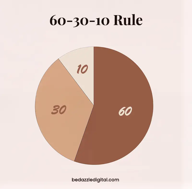
Stop guessing which colors work together! This designer secret creates perfectly balanced spaces:
-
60% Dominant Color: This will be the main color in your room, often on large surfaces like walls, rugs, or a sofa. In our warm minimalist approach, this will likely be a neutral tone.
-
30% Secondary Color: This supports the dominant color and adds interest. Think accent chairs, curtains, or bedding. You can introduce a slightly richer neutral or a subtle earthy tone here.
-
10% Accent Color: This is your pop of personality! Use it sparingly in cushions, artwork, or decorative accessories. This could be a slightly bolder earth tone or a muted metallic.
Why it works? This formula provides visual hierarchy tnd prevents your room from feeling overwhelming or flat.
Pro Tip: If your walls (60%) are Benjamin Moore’s Cloud White, your sofa (30%) could be in Pale Oak, with throw pillows (10%) in a muted Pottery Red.
Room by Room Examples with Warm Minimalist Color Palette
Living Room – Cozy Sophistication
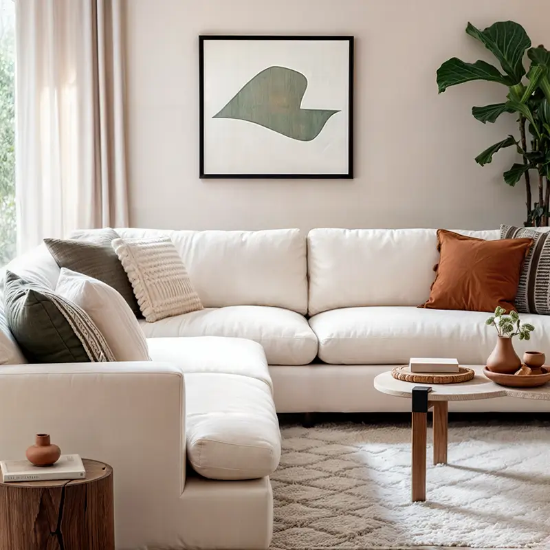
For a warm minimalist living room that feels sophisticated and inviting:
- Walls: Choose warm off-whites or soft greiges
- Furniture: Light beige or cream linen sofas with natural wood accent tables
- Textiles: Layer different textures in your neutral palette—think chunky knits, soft wool, and textured linen
- Accents: Add warmth with terracotta pottery and subtle brass elements
Check out more luxury living room ideas for additional inspiration.
Bedroom – Calm Sanctuary
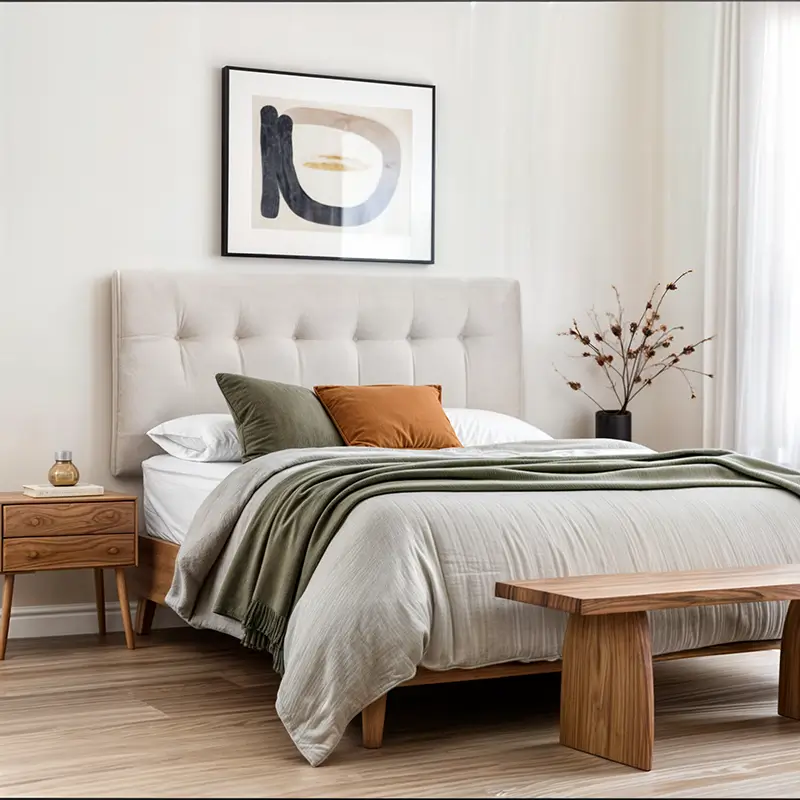
Create a warm minimalist bedroom retreat with:
-
Walls: Continue with your warm neutral from the living area or opt for a slightly softer shade.
-
Bedding: Layer different textures in your 60% dominant neutral – think linen duvet cover, cotton sheets, and a cozy knit throw in your 30% secondary tone.
-
Furniture: Natural wood bedside tables and a simple headboard maintain the minimalist feel.
-
Accents: Introduce your 10% with a muted earth-toned throw, a piece of abstract art, or a few dark ceramic decorative objects.
Why it feels good: High-quality, natural bedding and a clutter-free environment add a sense of luxury and tranquility.
Kitchen – Effortless Elegance
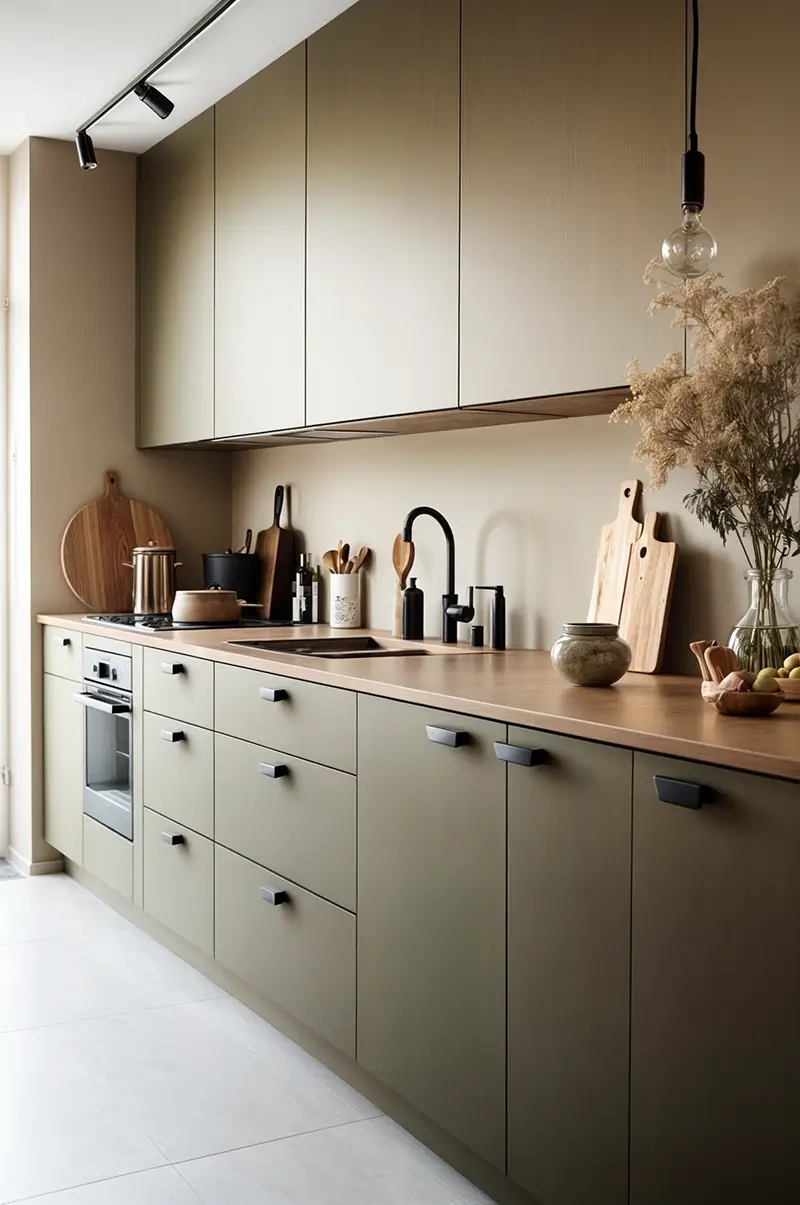
For a warm minimalist kitchen that feels both functional and beautiful:
- Cabinetry: Light wood tones or warm whites
- Countertops: Opt for natural materials in neutral shades
- Lighting: Modern pendant lights in your accent color
- Accents: Simple ceramic or glass vases with dried grasses or a terracotta bowl as centerpiece
Dining Area – Understated Elegance
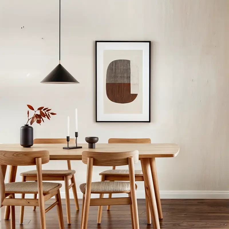
-
Walls: Keep the neutral flow going!
-
Furniture: A simple, well-crafted wooden dining table and chairs are key.
-
Lighting: Introduce a modern pendant light in a contrasting color like matte black (part of your 10%).
-
Accents: A simple ceramic vase with dried grasses or a terracotta bowl as a centerpiece adds a touch of organic beauty.
Why it feels good: Quality materials and a clean, uncluttered table setting exude understated elegance.
Bathroom – Spa-Like Simplicity
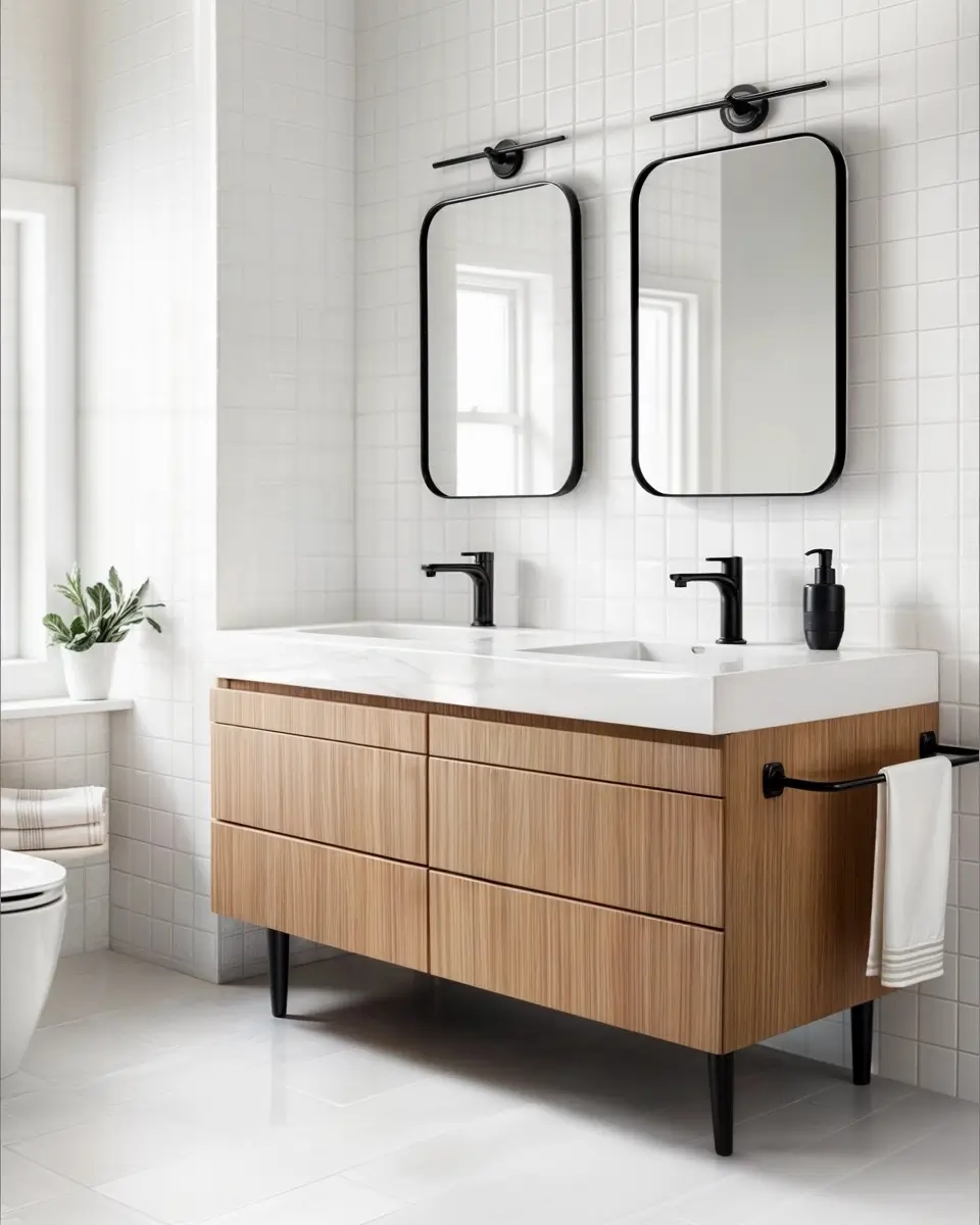
-
Walls: Crisp white or a very light warm gray creates a clean backdrop.
-
Fixtures: Opt for a sleek vanity in a light wood tone with a simple white countertop.
-
Hardware: Matte black or brushed nickel fixtures and hardware add a modern touch.
-
Textiles: Plush white or subtly colored earthy-toned towels.
-
Accents: A small potted plant or a few well-chosen natural accessories.
Why it feels good: Clean lines, quality materials, and a clutter-free surface create a serene and spa-like atmosphere.
Designer-Approved Color Palettes & Inspiration From Benjamin Moore
Looking for some professionally curated color schemes to get you started?
Here are a few ideas inspired by Benjamin Moore’s beautiful range:
- Warm Neutrals with Clay Accents:
- Serene Sage & Cream:
- Classic Grays & Wood:
- 60%: Benjamin Moore “Revere Pewter”
- 30%: Natural wood finishes
- 10%: Benjamin Moore “Iron Mountain”
Why Benjamin Moore?
They offer a vast range of high-quality paints with beautiful undertones that can truly elevate your space. Plus, their website is a treasure trove of color inspiration and pre-designed palettes!
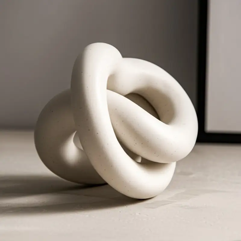
The Power of Thoughtful Decor
When it comes to accessories, less is more in warm minimalism.
Choose a few well-designed, high-quality pieces that you truly love.
Think sculptural objects, unique vases, or interesting books. Avoid cluttering surfaces with knick-knacks.
Why it feels good: Carefully selected décor items look intentional and reflect your personal style in a sophisticated way.
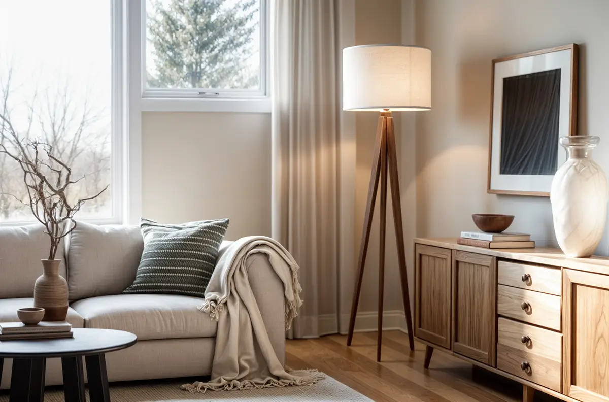
The Importance of Light
Never underestimate the impact of good lighting!
Maximize natural light by keeping window treatments light and airy. Then, layer in artificial light with floor lamps, table lamps, and even wall sconces to create a warm and inviting ambiance in the evenings.
Why it elevates the look: Well-placed lighting highlights the beautiful textures and colors in your space and adds a sense of depth and sophistication.
Get the Look:
-
Search: “Linen drum shade table lamp,” “tripod floor lamp,” “warm white light bulbs.”
-
Pro Tip: Use dimmers to control the intensity of your artificial light and create different moods.
Warm Minimalist Color Palette: Conclusion
There you have it! Your complete guide to building a foundation of warm minimalist color palette using the power of neutral and earthy tones, the magic of the 60-30-10 rule, and inspiration from the color experts at Benjamin Moore.
Creating a home that looks and feels good is about:
- thoughtful choices,
- quality over quantity, and
- embracing a sense of calm and intentionality.
For more in-depth guidance on minimalism, explore our Minimalist Color Palette for Home guide or dive into the latest minimalist design trends.
Warm Minimalist Color Palette: FAQ
Share your design inspirations:
About the Author

Branka Dancevic Architect & Interior Designer
Hi, I’m Branka! As a third-generation architect with two decades of experience, I’m passionate about creating warm minimalist spaces that feel luxurious without excess. I founded Bedazzle Digital to share my approach through design guides and resources. When I’m not transforming clients’ homes, you’ll find me testing new color palettes and hunting for the perfect balance of texture and simplicity. Join me in exploring stylish and sophisticated (mostly minimalist) interiors that are anything but boring!


Traditional vs Warm Minimalism: Which Minimalist Style Is Right for You? - Bedazzle Digital
December 19, 2025 @ 3:14 pm
[…] by contrast, embraces warm-toned neutrals like cream, beige, taupe, tan, and soft browns. These colors provide a calming base while allowing textures and materials to take center stage. Subtle earthy accents like olive green […]